How Ins and Outs makes a designed card in about a minute
A look inside Ins and Outs: five viral templates, five system-font themes, a live preview, and why rendering everything on the device makes it feel instant.
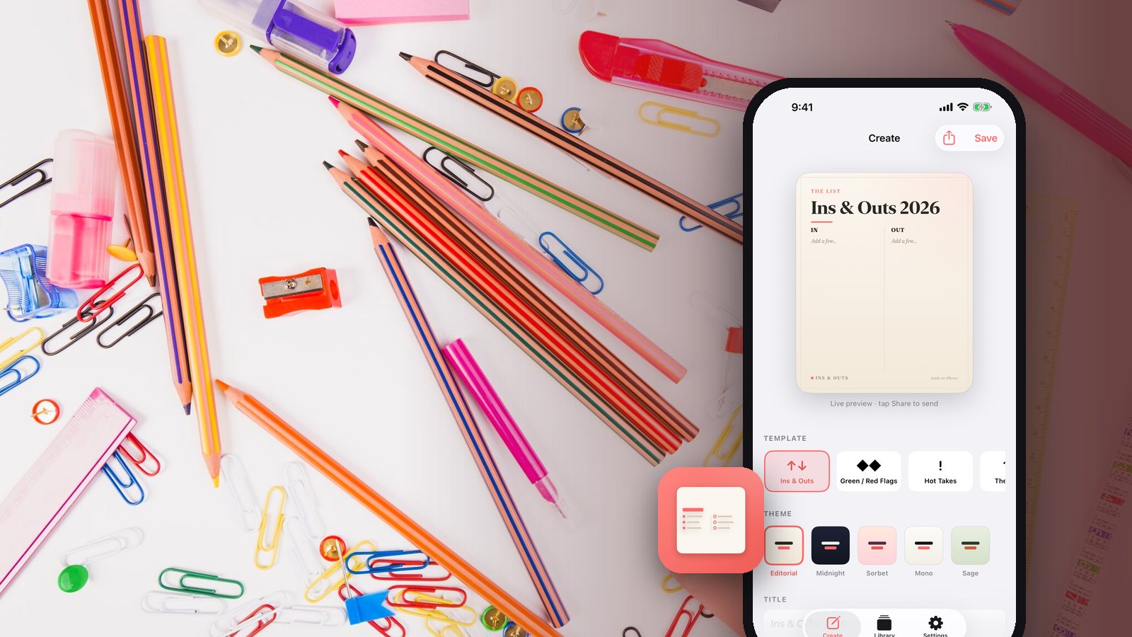
The "ins and outs" list is a format people post constantly, and making one that looks good is annoyingly hard. A general design app gives you a blank canvas and a font menu, which is too many decisions. A screenshot of a note is one decision and looks like it. The gap between those two is where Ins and Outs lives.
Templates carry the format, so you only bring opinions
You start by picking a shape rather than a canvas. There are five: the classic two-column ins and outs list, Green Flags and Red Flags, Hot Takes for the opinions you are less sure you should share, The Roster for a clean ranked list, and 2026 Bingo as a three-by-three grid of predictions.
Each template already knows how its content is supposed to be arranged. Column widths, spacing, and hierarchy are decided before you arrive. That removes the part of design work that is genuinely hard and leaves the part you are actually good at, which is having opinions about what belongs on the list.
Themes are a single tap, and the fonts are already on your phone
Five curated themes restyle the entire card at once: Editorial, Midnight, Sorbet, Mono, and Sage. Tapping between them is the fastest way to find out what your list wants to look like, because you are comparing finished cards instead of imagining them.
Every theme is built from system fonts and a small, deliberately tasteful color range. That is a design decision and a speed decision at the same time. Nothing downloads, nothing renders twice, and the preview updates as you type instead of after a wait.
Restricting the palette to five themes and the system font stack is not a limitation, it is the reason the card looks composed instead of assembled.
Everything happens on the device
The app is completely offline. There is no account, no login, no analytics, and no tracking. Your cards are created and stored on your phone and never leave it unless you share one yourself.
That is why the app feels immediate. There is no upload step between finishing your list and having an image, because there is no server involved at any point. The share action exports a crisp high-resolution portrait card straight into Messages, Instagram, your photo library, or wherever else you want it, using the standard share sheet so you choose the destination every time.
Saved cards go to a Library on the device, so you can come back and edit a list or re-share it later. It is a universal app, so the same thing works on iPhone and iPad, and it is free with no subscriptions, ever.
The design decision behind the speed
One choice explains most of the feel: the card is rendered locally as a live preview, and the thing you are looking at while you type is the thing that gets exported. There is no render queue, no "generating" state, and no gap between the draft and the result.
Formats like this move fast, and the next one is already on its way. Making a card should take about as long as having the thought that started it. If you want more of the same approach, the other apps we make share the offline, no-account default.
Related posts
-
How-to
How to make an ins and outs list you'll actually stick to
Oct 13, 2026
-
How-to
How to find and cancel the subscriptions you forgot about
Sep 27, 2026
-
Product
How EOB Keeper matches your bill to your insurance statement
Sep 18, 2026
Recent posts
-
How-to
How to cook a week of dinners from one grocery run
Oct 21, 2026
-
AI & Trends
How to tell when an AI answer is wrong
Oct 21, 2026
-
How-to
How to learn a trade as an adult (electrician, plumber, HVAC, welding)
Oct 20, 2026
-
How-to
How to watch a game later without spoilers
Oct 19, 2026
-
How-to
How to photograph fall colors with your phone
Oct 19, 2026
-
How-to
How to warm up before lifting in 8 minutes (and what to skip)
Oct 18, 2026
0 comments
No comments yet — be the first.
Leave a reply
Sign in with Google to join the conversation. We require a quick sign-in to keep comments spam-free.
Sign in with Google to comment